Finding a True-to-Color Photographer in Omaha: A Golden Hour Guide
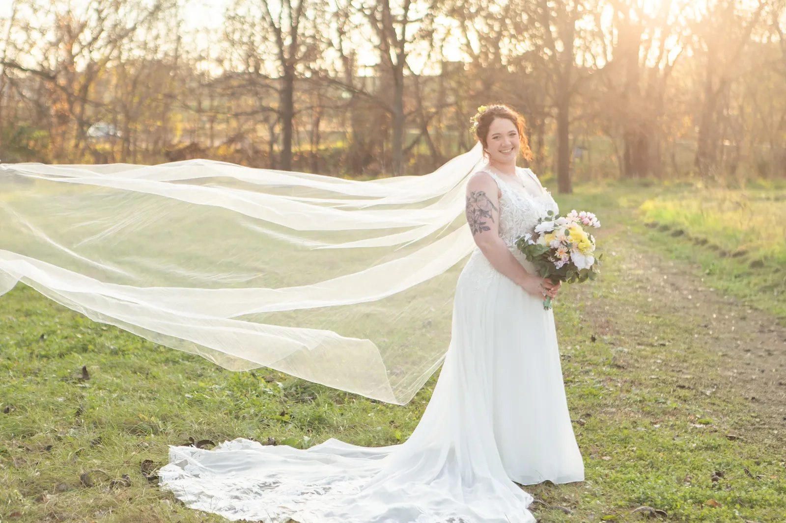
Have you ever gotten your photos back and thought, wait, that doesn't look like us? The skin looks a little orange. Or gray. The dress went from ivory to stark white. The whole gallery has that same pale, filtered look, and somewhere in there... you got lost.
That's what I never want for you. This guide is about finding a photographer who keeps your photos true to color, so they look like you, only in the best light. I'll cover what true-to-color actually means, how to spot it in a portfolio, what to wear (with specific colors that pop against golden hour), and what happens if the light doesn't show up the way we planned.
What Is True-to-Color Photography?
True-to-color means the colors in your photos match the colors in real life. Your skin looks like your skin. Your partner's blue eyes are blue. The blush in your bouquet is blush, and your grandmother's navy dress is navy, not a faded, muddy blue-gray.
It's the opposite of heavy editing that bleaches everything out or pushes it toward one trendy palette. Some styles, like light and airy, brighten and desaturate on purpose. They can be pretty, and I love the openness of them. But those styles change the way you actually looked that day, and I'd rather you remembered it the way it looked and happened.
So where does golden hour come in? Golden hour is the light. True-to-color is the promise. I shoot my non-wedding sessions in the window from about 30 minutes before sunset to 30 minutes after, because low, warm, glowy light does so much of the work for me. The romance is already in the light. I don't have to edit the photos as much, because your skin smooths out in golden hour, and you glow without any assistance from my editing software.
Why Choose a True-to-Color Photographer?
- You'll recognize yourselves. Years from now, you'll look at these and remember how it felt. Not how a filter or heavy color grading felt.
- It doesn't go out of style. Editing trends come and go (remember when everything was orange and teal? I do, and thank heavens we've moved on). Honest color keeps looking good, the way old film photos still do.
- What you wear is what you get. Pick an outfit you love and it'll look like that outfit. No surprises when the gallery comes back.
- You don't have to figure out the light. Finding the light is my job. You show up, I'll tell you where to stand, how to hold each other, and help you guys make each other laugh.
How to Find a True-to-Color Photographer in Omaha
Start with the portfolios. Instagram and Pinterest are great for browsing, and you can search tags like #omahaphotographer or #omahaweddingphotographer. Wedding blogs and local vendor directories help too. And of course, good old Google can pull up a search of "true to color photographers in Omaha" and get you a pretty good list. Just make sure you actually look at their galleries and portfolios, as occasionally the search may return more "photographers in Omaha" than "true to color."
You can also ask around. Venues, florists, and recently married friends are gold. If someone's photos look like them, ask who took them.
Once you've got a shortlist, it's time for the real test.
The True-to-Color Portfolio Test
Don't stop at the highlight reel. Look at full galleries if the photographer shares them, and check a few things:
- Skin tones. Do people look natural, or a little orange, gray, or washed out? Does skin look consistent from photo to photo?
- Whites and creams. A wedding dress should look like the dress. Ivory should look ivory, not paper white, and vice versa.
- Greens. Grass and trees should look like grass and trees, not neon, not yellow, not gray.
- Consistency. Do the colors feel the same from the first image to the last, in sun and in clouds? Understand that a dark indoor reception hall will look vastly different from a light, open ceremony venue, but within that, does it look consistent?
- Real moments. Are people relaxed, laughing, actually with each other?
And pay attention to how a photographer talks to you when you inquire. The portfolio is half the story. The other half is whether you feel comfortable spending an entire session or a 10-hour wedding day around them.
Where Golden Hour Fits In
I'll say it plainly: golden hour is my favorite, and it's where I've always come back to. The light is warm, soft, and kind to everyone. It wraps around people. It makes hair glow. And since the warmth is built into the light, the colors stay honest.
Your session time will be built around sunset, which shifts through the year here in Omaha. I'll figure out the exact time. You just pick a date. And I have favorite spots around town that glow in the evening (and aren't crowded, because it's hard to relax with an audience). You don't have to scout a thing.
What to Wear for True-to-Color Photos
Here's the thing about golden hour: the background is usually green and gold. Trees, tall grass, fields, warm sunlight. That's beautiful! But it also means some outfits quietly disappear into it.
Because I keep your photos true to color, the color you wear is the color you get. So pick a shade you love, and then choose one of these two directions.
Option 1: Colors That Stand Out from Green and Gold
These sit on the other side of the color wheel, so they pop against foliage and warm light:
- Dusty blue, slate blue, or navy. Blue is the classic complement to golden light. Soft, calm, and so flattering.
- Burgundy or wine. Rich and romantic, especially in fall.
- Plum or deep purple. Unexpected and gorgeous against greenery.
- Blush pink or dusty rose. Soft and warm, and a beautiful contrast to green.
- Lavender or lilac. Lovely for spring and summer sessions.
I'd skip olive, sage, forest green, mustard, black, and khaki. They blend right into the background. In fall, be careful with rust and burnt orange too, since the fields are already doing that.
Option 2: The Tried-and-True Neutrals
Neutrals are neutral for a reason. They never fight the scenery, and they look timeless:
- Cream and ivory. These glow in warm light.
- White. Crisp and clean (just not stark, bright-white-on-bright-white).
- Soft gray or charcoal. Understated and pretty in every season.
- Light blues and blush pinks. The gentle ones, still lovely.
Tan and camel can melt into dry fall grass, so I'd use them as an accent rather than the main color.
Mix It Up
Let one person wear the color and the other wear a neutral. Coordinate, don't match. Burgundy with cream. Navy with ivory. Blush with soft gray.
Look for flowing fabrics like chiffon, linen, and tulle. They catch the breeze and look beautiful in motion. Skip neon, tiny busy patterns, and big logos. I have a whole blog post on what to wear if you want even more detail.
Hair and makeup. Natural and polished. Skip the shimmer and glitter. For a bridal session, a professional hair and makeup artist is worth it.
Props and details. Less is more. A simple bouquet, a hat, a favorite blanket, something that means something to you.
What Happens If We Miss Golden Hour?
Let's be real: it happens. Weather rolls in. A ceremony runs long. Traffic is traffic. Nebraska decides to do Nebraska things.
So here's what we do. You've got two options, and both are totally okay.
Option 1: We reschedule. If it's a portrait, family, engagement, or bridal session and the weather isn't going to cooperate, we find another date. No stress, no guilt. I'd rather catch the light right than force it.
Option 2: We work with what we've got. And this is absolutely doable! It's just going to look a little different than what you were expecting.
Here's what that looks like:
- Overcast skies: The light goes soft and even. You lose the warm sunset glow, but skin looks smooth and colors look rich. The mood is quieter and a little more moody-romantic.
- Bright midday sun: I'll use open shade and positioning to keep things flattering. It's crisper than golden hour, but still lovely.
- After the sun is gone: The blue hour right after sunset is soft and cool. For a wedding, I'll use flash to keep things beautiful.
- Indoors: Big windows, a cozy room, a little flash when needed. Still plenty of warmth and connection.
Here's the good news about true-to-color: it works in any light. I'm not editing your photos to match a sunset that never showed up. The warm glow might be softer, but your colors, your skin, and your people stay exactly who they are.
I'll never promise you a sunset I can't control; nobody can. What I can promise is that I'll make the most of whatever we're given. If you're planning a wedding, this is also why we build your timeline around the light from the start. The earlier we plan for it, the less you have to worry about on the day.
Cost of True-to-Color Photography in Omaha
Pricing varies a lot from photographer to photographer, depending on experience, demand, and what's included. Most will charge either a session fee (for the time and creative work of the shoot) or a package that includes a set number of edited images. Weddings are usually priced as packages covering a set number of hours, often with an engagement session and online gallery.
When you're comparing, don't just look at the number. Look at what you actually get: how many edited images, print rights, albums or wall art, how long the session is, and whether the photographer guides you through it. A cheaper price can feel expensive if you're left wondering what to do with your hands the whole time.
Frequently Asked Questions
What does true-to-color photography mean? It means the colors in your photos match real life. Your skin, your clothes, your eyes, and the scenery look like they did that day. There's no heavy editing to make everything pale, pastel, or one trendy tone.
Is true-to-color the same as bright and airy? Not quite. Bright and airy usually brightens and softens colors on purpose. I love the openness of it, but I keep my photos true to color, so I'm not changing the colors of your clothes or your skin to match a specific aesthetic. Golden hour gives me that dreamy, bright feeling naturally, with the warmth already in the light. If you're curious what that looks like, head over to my gallery!
What should I wear for my photos? Pick a color you love. Dusty blue, navy, burgundy, plum, and blush stand out beautifully from green and gold backgrounds. Cream, ivory, white, and soft gray are tried-and-true neutrals. Skip olive, sage, mustard, true black, and neon.
What's the best time of day? The hour or so around sunset. I shoot from about 30 minutes before to 30 minutes after, when the light is warm, soft, and low.
What if the weather is bad? We either reschedule or work with the conditions. Cloudy days can still give you gorgeous portraits. They just look a little different than a glowing sunset.
Can I book you? Absolutely! I'll help you plan the whole thing: the date, the time, the location, and what to wear. You just show up and I'll guide you through the rest. If you're interested, fill out my inquiry form and let's chat!
Let's tell your story
If you're planning your wedding or a session in Omaha, I'd love to hear from you.
Get in Touch